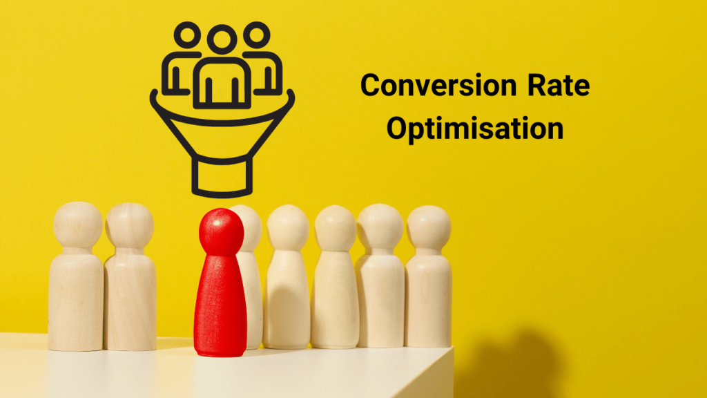
Small tweaks to your landing pages can lead to huge increases in conversion rates. By optimizing your landing page through A/B testing various elements, you can significantly boost your ecommerce conversion rates.
A Clear Headline with Your Keyword
A strong headline is critical for capturing attention. For example, “10 Landing Page Hacks to Skyrocket Your NZ Ecommerce Conversions” uses an emotive keyword like “skyrocket” to grab interest. Headlines should be benefit-focused and contain your target keyword. A/B test different headlines to see which one resonates most.High-Quality Images
Images evoke emotion and help bring your product to life. For example, an ecommerce site selling hiking gear might show dramatic nature shots of people using their products. A/B test different images to determine which ones make the biggest impact.A Strong Call-to-Action
An effective call-to-action like “Start your free trial today” or “Buy now and save 20%” makes it easy for customers to take the next step. Test different CTAs by changing the text, color, size, and placement to optimize conversions.A Clear Value Proposition
Your value proposition states how you will solve the customer’s needs. For example, an ecommerce site selling natural skincare products might say: “We provide organic, handcrafted skincare using only the freshest natural ingredients to nourish your skin and promote natural beauty.” A/B test different value prop variations to find the most compelling option.Social Proof with Customer Reviews and Testimonials
Nothing builds trust in your product like positive reviews from satisfied customers. Consider adding a section on your landing page that features customer testimonials or star ratings. This not only builds credibility but also provides an added layer of social proof. You can A/B test various layouts, the number of reviews shown, or whether to include photos or names with the testimonials.Scarcity with Limited Time Offers
People are inclined to act immediately when there’s a time limit or scarcity involved. Generate a sense of urgency by offering limited-time discounts or highlighting the limited availability of your product. A/B test different messaging or countdown timers to see what drives more conversions.Simplifying the Page with Minimal Distractions
A cluttered landing page can be overwhelming and might distract your potential customers from the main call to action. Make your landing page crisp and clear with minimal distractions. Test different designs with a variety of element positioning and see which offers a more smooth and non-distractive user journey.Building Trust with Security Badges and Guarantees
Shoppers need to trust your ecommerce site with their financial information. A proven way to build this trust is by displaying security badges and guarantees. This could be SSL certificates, money-back guarantees, or secure payment icons. Experiment with different types & placements of badges to find which most effectively reassure your customers.Choosing the Right Colors for Your CTA
Colors play a significant role in website design and can greatly influence user engagement, especially with your CTAs. In order to encourage users to click on your CTAs, it’s essential to choose the right colors that stand out and evoke the desired emotions.For example as a test, click on one of the CTAs below:Attention-grabbing colors
Opt for colors that grab the user’s attention and create contrast with the background. This will make your CTAs more noticeable, ultimately increasing click-through rates. Some popular choices for attention-grabbing colors are:- Red: Conveys a sense of urgency and excitement
- Orange: Gives off a sense of enthusiasm and energy
- Green: Symbolizes growth and is often associated with “go” or “proceed”
- Blue: Represents trust and stability
Creating contrast
Ensure that your CTA colors provide enough contrast with the surrounding elements on your landing page. This will make your CTAs stand out and be more easily noticed by users as they scroll through your content. A simple way to test contrast is by using online tools such as the WebAIM Contrast Checker or Coolors Contrast Checker.Aligning with your brand
While it’s essential to use colors that stand out, it’s also important that they align with your brand’s color scheme and overall design. This will ensure a consistent and professional look on your landing page. If necessary, consider using different shades or tints of your primary brand colors for your CTAs.Performing A/B testing
Conduct A/B testing by showcasing various color combinations for your CTAs to identify the most effective color choice. Testing different colors can provide valuable insights on which colors resonate better with your audience and lead to higher conversion rates.Understanding Your Product: Is It Driven by Excitement or Practicality?
Another critical aspect to consider in optimizing your landing page is understanding the nature of your product. By figuring out whether your product is often bought on impulse out of excitement or emotion, or requires careful thought and consideration, you can tune your approach to more effectively tap into your audience’s buying behavior.Excitement or Emotion-driven Products
Products that tap into the user’s excitement or emotions often lead to impulse buys. These can include trendy clothing, gadgets, beauty products, or anything that offers an immediate emotional gratification or a solution to an urgent problem.With these products:- Highlight the immediate benefits and satisfaction that customers will receive from the product.
- Employ high-energy, emotive language to stir up excitement or emotional connection.
- Use high-quality, provocative images to catch the audience’s eye.
- Instill a sense of urgency or scarcity, like limited-time offers or limited stock, to encourage immediate purchases.
Practical or Considered Purchase Products
On the other hand, some items don’t suit impulsive buying, and these are often more expensive or complex products like electronic devices, software solutions, or subscription services. Buyers usually need more time and information before making a decision here.For such products:- Emphasize the product’s value proposition and how it solves the customer’s needs or problems.
- Provide comprehensive details about the product, including features, specifications, and comparison with similar products.
- Include social proof like detailed reviews and testimonials to build trust and confidence in the product.
- Offer a clear, low-risk call-to-action, such as a free trial or downloadable demo.
Surveys and Market Research
Regardless of your initial understanding, conducting surveys and market research can provide valuable insights into the buying habits and motivations of your customer base. Observing patterns in how your customers interact with your website and products can aid in adjusting your strategies to fit their behaviors better.Conclusion
With strategic tweaks and continuous A/B testing, your landing pages can be more than just aesthetic – they can be conversion machines. Remember to focus on crafting compelling headlines, using high-quality images, utilizing persuasive CTAs, and ensuring a clear value proposition. Finally, remember that the goal is to uphold trust, generate urgency, and keep the page simple and impressive. By following these simple yet powerful hacks, you can truly skyrocket your NZ ecommerce conversions.| Landing Page Hack | Brief Description |
|---|---|
| Clear Headline with Your Keyword | A strong, benefit-focused headline that contains the target keyword. |
| High-Quality Images | Emotive, high-quality images bringing the product to life. |
| Strong Call-to-Action | An effective CTA making it easy for customers to proceed further. |
| Clear Value Proposition | Announces how the product will solve the customer’s needs. |
| Social Proof | Positive customer reviews and testimonials lending credibility. |
| Scarcity | Limited-time offers promoting urgency. |
| Minimal Distractions | A clean landing page design minimizing distractions. |
| Trust-Building Elements | Security badges and guarantees instilling trust in users. |